Using a ToggleButton in your XAML Metro style AppBar
If you’ve been playing around with the Windows 8 Consumer Preview then hopefully you’ve seen the hundreds of samples provided and downloaded some apps form the store. In a lot of those applications you’ll notice the common theme of the use of an AppBar…the command bar that shows when you swipe from the top or bottom of the screen. You can also invoke the AppBar by right-clicking or using the Windows 8 keyboard shortcut of Windows key + ‘z’ to bring it up as well.

Picture of the AppBar in the Bing Maps application
Most of the applications use the standard AppBar button concepts that clicking invokes some action for the app. There may be times, however, where that button serves as a “toggle” to something in your app. Using the Bing Maps app as an example, the “Show Traffic” command is actually a toggle command that, well, shows traffic. You want to give your users some visual indication whether that toggle selection is on/off. This can be accomplished in XAML by using 2 buttons and toggling their visibility, but that may be overkill for what you simple want to do.
The Visual Studio project templates provide a set of styles for the AppBar for you, but more importantly a base style AppBarButtonStyle that serves as the core design. Altering this just slightly and you can have a ToggleAppBarButtonStyle for your project. Here’s the style for that base:
1: <Style x:Key="ToggleAppBarButtonStyle" TargetType="ToggleButton">
2: <Setter Property="Foreground" Value="{StaticResource AppBarItemForegroundBrush}"/>
3: <Setter Property="VerticalAlignment" Value="Stretch"/>
4: <Setter Property="FontFamily" Value="Segoe UI Symbol"/>
5: <Setter Property="FontWeight" Value="Normal"/>
6: <Setter Property="FontSize" Value="21.333"/>
7: <Setter Property="AutomationProperties.ItemType" Value="AppBar ToggleButton"/>
8: <Setter Property="Template">
9: <Setter.Value>
10: <ControlTemplate TargetType="ToggleButton">
11: <Grid Width="100" Background="Transparent">
12: <StackPanel VerticalAlignment="Top" Margin="0,14,0,13">
13: <Grid Width="40" Height="40" Margin="0,0,0,5" HorizontalAlignment="Center">
14: <TextBlock x:Name="BackgroundGlyph" Text="" FontFamily="Segoe UI Symbol" FontSize="53.333" Margin="-4,-19,0,0" Foreground="{StaticResource AppBarItemBackgroundBrush}"/>
15: <TextBlock x:Name="BackgroundCheckedGlyph" Visibility="Collapsed" Text="" FontFamily="Segoe UI Symbol" FontSize="53.333" Margin="-4,-19,0,0" Foreground="{StaticResource AppBarItemForegroundBrush}"/>
16: <TextBlock x:Name="OutlineGlyph" Text="" FontFamily="Segoe UI Symbol" FontSize="53.333" Margin="-4,-19,0,0"/>
17: <ContentPresenter x:Name="Content" HorizontalAlignment="Center" Margin="-1,-1,0,0" VerticalAlignment="Center"/>
18: </Grid>
19: <TextBlock
20: x:Name="TextLabel"
21: Text="{TemplateBinding AutomationProperties.Name}"
22: Margin="0,0,2,0"
23: FontSize="12"
24: TextAlignment="Center"
25: Width="88"
26: MaxHeight="32"
27: TextTrimming="WordEllipsis"
28: Style="{StaticResource BasicTextStyle}"/>
29: </StackPanel>
30: <Rectangle
31: x:Name="FocusVisualWhite"
32: IsHitTestVisible="False"
33: Stroke="{StaticResource FocusVisualWhiteStrokeBrush}"
34: StrokeEndLineCap="Square"
35: StrokeDashArray="1,1"
36: Opacity="0"
37: StrokeDashOffset="1.5"/>
38: <Rectangle
39: x:Name="FocusVisualBlack"
40: IsHitTestVisible="False"
41: Stroke="{StaticResource FocusVisualBlackStrokeBrush}"
42: StrokeEndLineCap="Square"
43: StrokeDashArray="1,1"
44: Opacity="0"
45: StrokeDashOffset="0.5"/>
46: 47: <VisualStateManager.VisualStateGroups>
48: <VisualStateGroup x:Name="CommonStates">
49: <VisualState x:Name="Normal"/>
50: <VisualState x:Name="PointerOver">
51: <Storyboard>
52: <ObjectAnimationUsingKeyFrames Storyboard.TargetName="BackgroundGlyph" Storyboard.TargetProperty="Foreground">
53: <DiscreteObjectKeyFrame KeyTime="0" Value="{StaticResource AppBarItemHoverBackgroundBrush}"/>
54: </ObjectAnimationUsingKeyFrames>
55: </Storyboard>
56: </VisualState>
57: <VisualState x:Name="Pressed">
58: <Storyboard>
59: <DoubleAnimation
60: Storyboard.TargetName="OutlineGlyph"
61: Storyboard.TargetProperty="Opacity"
62: To="0"
63: Duration="0"/>
64: <ObjectAnimationUsingKeyFrames Storyboard.TargetName="BackgroundGlyph" Storyboard.TargetProperty="Foreground">
65: <DiscreteObjectKeyFrame KeyTime="0" Value="{StaticResource AppBarItemForegroundBrush}"/>
66: </ObjectAnimationUsingKeyFrames>
67: <ObjectAnimationUsingKeyFrames Storyboard.TargetName="Content" Storyboard.TargetProperty="Foreground">
68: <DiscreteObjectKeyFrame KeyTime="0" Value="{StaticResource AppBarItemPressedForegroundBrush}"/>
69: </ObjectAnimationUsingKeyFrames>
70: </Storyboard>
71: </VisualState>
72: <VisualState x:Name="Disabled">
73: <Storyboard>
74: <ObjectAnimationUsingKeyFrames Storyboard.TargetName="OutlineGlyph" Storyboard.TargetProperty="Foreground">
75: <DiscreteObjectKeyFrame KeyTime="0" Value="{StaticResource AppBarItemDisabledForegroundBrush}"/>
76: </ObjectAnimationUsingKeyFrames>
77: <ObjectAnimationUsingKeyFrames Storyboard.TargetName="Content" Storyboard.TargetProperty="Foreground">
78: <DiscreteObjectKeyFrame KeyTime="0" Value="{StaticResource AppBarItemDisabledForegroundBrush}"/>
79: </ObjectAnimationUsingKeyFrames>
80: <ObjectAnimationUsingKeyFrames Storyboard.TargetName="TextLabel" Storyboard.TargetProperty="Foreground">
81: <DiscreteObjectKeyFrame KeyTime="0" Value="{StaticResource AppBarItemDisabledForegroundBrush}"/>
82: </ObjectAnimationUsingKeyFrames>
83: </Storyboard>
84: </VisualState>
85: </VisualStateGroup>
86: <VisualStateGroup x:Name="FocusStates">
87: <VisualState x:Name="Focused">
88: <Storyboard>
89: <DoubleAnimation
90: Storyboard.TargetName="FocusVisualWhite"
91: Storyboard.TargetProperty="Opacity"
92: To="1"
93: Duration="0"/>
94: <DoubleAnimation
95: Storyboard.TargetName="FocusVisualBlack"
96: Storyboard.TargetProperty="Opacity"
97: To="1"
98: Duration="0"/>
99: </Storyboard>
100: </VisualState>
101: <VisualState x:Name="Unfocused" />
102: <VisualState x:Name="PointerFocused" />
103: </VisualStateGroup>
104: <VisualStateGroup x:Name="CheckStates">
105: <VisualState x:Name="Checked">
106: <Storyboard>
107: <DoubleAnimation
108: Storyboard.TargetName="OutlineGlyph"
109: Storyboard.TargetProperty="Opacity"
110: To="0"
111: Duration="0"/>
112: <ObjectAnimationUsingKeyFrames Storyboard.TargetName="BackgroundGlyph" Storyboard.TargetProperty="Foreground">
113: <DiscreteObjectKeyFrame KeyTime="0" Value="{StaticResource AppBarItemForegroundBrush}"/>
114: </ObjectAnimationUsingKeyFrames>
115: <ObjectAnimationUsingKeyFrames Storyboard.TargetName="BackgroundCheckedGlyph" Storyboard.TargetProperty="Visibility">
116: <DiscreteObjectKeyFrame KeyTime="0" Value="Visible"/>
117: </ObjectAnimationUsingKeyFrames>
118: <ObjectAnimationUsingKeyFrames Storyboard.TargetName="Content" Storyboard.TargetProperty="Foreground">
119: <DiscreteObjectKeyFrame KeyTime="0" Value="{StaticResource AppBarItemPressedForegroundBrush}"/>
120: </ObjectAnimationUsingKeyFrames>
121: </Storyboard>
122: </VisualState>
123: <VisualState x:Name="Unchecked"/>
124: <VisualState x:Name="Indeterminate"/>
125: </VisualStateGroup>
126: </VisualStateManager.VisualStateGroups>
127: </Grid>
128: </ControlTemplate>
129: </Setter.Value>
130: </Setter>
131: </Style>
Now with that style we can have a simple style that shows a toggle on and off for the same button:
1: ... 2: <Page.BottomAppBar>
3: <AppBar>
4: <ToggleButton Style="{StaticResource ToggleAppBarButtonStyle}"
5: AutomationProperties.Name="Search"
6: Content="" />
7: </AppBar>
8: </Page.BottomAppBar>
9: ... The result would show:
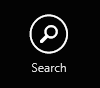
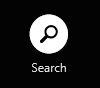
ToggleButtonAppBarStyle in off/on state
This way we exhibit all the same behaviors of the AppBarButtonStyle, but just applied to the ToggleButton element in XAML. Now we could probably refactor both to have an even more derivative base style and use more BasedOn styling, but how it is currently structured we couldn’t have a ToggleButton based on a Button style. But thanks to the style/template engine in XAML we can re-use a lot and serve our needs!
Notice that you can set the Content to be whatever you want. Since my base style uses the Segoe UI Symbol font, I’m setting the unicode value for a glyph here for Search. A set of some cool glyphs you can use can be found in my previous post on XAML AppBar button styles.
You can get the ToggleAppBarButtonStyle from here: https://gist.github.com/2131230.
Hope this helps!
Please enjoy some of these other recent posts...