Skinning an embeddable Silverlight 2 media player
- | Posted in
- silverlight
- media
- media player
- embed
- controls
- initParams
- skinning
While Silverlight 2 brings us great capabilities as .NET developers and opens many opportunities for creating rich clients in the browser, it still supports strong media features that have been available since the initial release of Silverlight. The ability to deliver efficient, high quality media in the browser is an increasing need in a lot of sites producing content for their members. Traditional ‘podcasts’ which were historically audio-only, are moving increasingly faster to richer media. This is nothing new of course, but being able to quickly distribute the media on your sites efficiently and provide methods for your users to either embed content, or for you to deliver content to other sites means you need a predictable method for doing that.
In Silverlight 1, while it supported all the same features, one thing that I (and presumably you as well) didn’t find attractive was the deployment scenarios for delivering media content via players. Silverlight 1 required the distribution of various scripts and initialization functions. This wasn’t ideal for providing you with something you can just drop into a web page anywhere. In fact, it was preventative in some places like MySpace, for example.
Silverlight 2 brings a new packaging model, the XAP (pronounced “zap”) file. Essentially this is an archive file which contains a manifest, reference assemblies and any custom code you have created. It can also contain resources that your application may use. Because we have this format now, we aren’t restricted to delivering multiple files for our application…we can deliver our application in one file essentially (your mileage may vary depending on your needs).
Great, now we have a good packaging model, but what about drawing my own controls, etc.?
True, Silverlight 1 had a gap of native controls to the runtime, requiring you to be creative with XAML to deliver functionality. In the typical media player scenario where you want a few timelines, volume bar, etc…even the trivial tasks required you to wire up some functionality. Well, Silverlight 2 brings us a common set of controls now that we can leverage.
So let’s take a look at an implementation of a Silverlight 2 media player. I’m going to use a base player created by Joel Neubeck who has been doing some really great posting on Silverlight lately. In this example I’m going to try to articulate what Joel did with the base controls and demonstrate how he was able to create an effective use of styling and controls to create a re-usable player. Additionally, I’m going to add a few new features to it for my desires.
I’m not going to go into the full details of this code, but wanted to point out the key features of what Joel accomplished as I think it was clever use of some controls you might not have considered to use in this scenario. As well, I’ll show what I added and why.
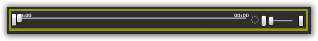
The Controls
We’ll need a play/pause button, a track timeline, perhaps a download timeline, volume controls, and full-screen button. We could do these in various ways. For our buttons we could create canvas elements and add a lot of code to switch them on/off. We could use a regular button and hide/show different ones. I thought Joel made an excellent choice in choosing to use a ToggleButton. The ToggleButton is still a button with all the same features, but supports more than just a normal/pressed state. Essentially it supports a ‘checked’ state similar to a checkbox or something. This is useful because we’re using this to basically provide play and pause capabilities. By using a ToggleButton, we can essentially make the ‘normal’ state the Play view and the pressed (checked) state the Pause view.
Okay, now for the tracks. In Silverlight 1 we would have to use a few rectangles on top of each other, add our mouse capture code, etc. In Silverlight 2, Joel saw the Slider as being an effective way of showing a linear timeline and it provides the functionality for value changing and a thumb for scrubbing, etc. Perfect. We’ll use the Slider for the download and volume features as well.
So once we add these to our design surface (Joel chose to create the media controls as a separate UserControl) it looks like this:
Skinning the Controls
Blah. That looks like crap and rather button-sh. Here is where skinning comes in. Jesse just completed a good tutorial on skinning controls that provide a little more depth. Using this techniques, we can define at a more granular level what we want our content views to be. For example on the play/pause button, instead of a ‘button’, we replace the content with Path elements that are geometric shapes rather than a typical button look. In combination now with implementing states in the styles (i.e., Normal State, Pressed State, Checked State) we can define that when the button is pressed (checked) what it shall do/look like by pre-defining the state.
We apply these same concepts to our other controls like the slider, able to skin the timeline area independent from the thumb scrubber, etc. We put our styles in App.xaml so they are globally available to the application. Do this with the volume control and other buttons (mute/full-screen) and now our exact same media controls (without affecting any real code that controls the logic), we now have this look:
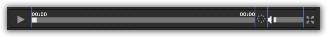
which looks much more like what we are after.
Now Joel’s initial example was fixed to a specific size of a media file. I want my player to scale to whatever the container is. Essentially I removed all specific sizes from XAML where appropriate and changed the media controls container grid so that the center column (where the timeline sliders are) will expand/contract as needed. This gives us two features. The first is that we have a re-usable control area regardless of the media element size. The second is that when the user goes into full screen mode, the controls also expand to full screen appropriately. The only thing you have to do is set the containing <div> where this media player is going to live to the desired size (i.e., 640x480) and the application will scale the internal elements to fill that space accordingly. Full screen mode will as well adjust the controls to fill the screen.
I also added a bigger “Play” indicator (and buffering indicator) that would show in the center of the MediaElement when paused or buffering. I felt this gave more visual cueing to what was going on with the media. This also scales as it looks at the ActualWidth/Height properties and grabs the center points based on that. Here’s the resulting paused view in two different sizes:
640x480 view

320x240 view

Providing Startup Parameters
The next thing I wanted to do is eliminate the hard-coding of the MediaElement Source property in the base XAML file. I just created a player with all my needs and want to re-use it without recompiling, etc. Here’s where InitParams comes in for developers. One thing we can do to the plugin is pass startup parameters to it. These are surfaced using the InitParams functionality. You can specify a comma-delimited list of name/value pairs in this property like:
firstName=Tim,lastName=Heuer,loves=Silverlight
which in turn get put into a Dictionary object in code. These elements are retrievable in your applications Application_Startup in the StartupEventArgs. the Application_Startup is in the App.xaml file (you can think of this as a global.asax file if you are an ASP.NET developer). There are different ways you can implement grabbing these values out. You could pull values (or just one value) out using a simple retrieval of the key value:
string firstName = e.InitParams[“firstName”].ToString();
You could set this to a public static variable that could then be accessed by your application. I chose to simply iterate through the initialization parameters and add them to the resources collection of the application. I haven’t decided yet if this is the most effective use, but for now it works and was simple:
foreach (var item in e.InitParams)
{
    if (item.Key.ToLower() == "m")
    {
        string mediaParam = e.InitParams["m"].ToString();
        Uri mediaUri;

        if (mediaParam.Contains("://"))
        {
            mediaUri = new Uri(mediaParam, UriKind.RelativeOrAbsolute);
        }
        else
        {
            mediaUri = new Uri(mediaParam, UriKind.Relative);
        }

        this.Resources.Add("m", mediaUri);
    }
    else
    {
        this.Resources.Add(item.Key, item.Value);
    }
}
You’ll see that i check for an “m” parameter and do an additional checking on that. I’m using this parameter for passing in the source for the MediaElement and need to check if it is an absolute URI or if the media will be local to the Silverlight application. Then any other initialization params get added to the collection as well. This might not make sense because I’m really only using two: source and autostart and if I wanted to make this re-usable, I would really need to build up more options and put them in the code too, or else nothing is being used. I’ll likely do that later, so let’s move on.
Now that we have these items in our Resources collection, my app continues to load and set the MediaElement source to that value:
mediaPlayer.Source = App.Current.Resources["m"] as Uri;
As a // TODO I need to add some error checking and display the thumbnail if there is a problem perhaps, but I’ll get to that later. Anything else I might need to do with the startup params I can get them out using the same method as above now that they are in my Resources collection.
So now in my control hosted page I have this:
<div style="width:640px;height:480px">
    <asp:Silverlight ID="Xaml1" runat="server"
    InitParameters="m=LEADER_ST2.wmv,autostart=false"
    Source="~/ClientBin/VideoPlayer.xap" Version="2.0"
    Width="100%" Height="100%" />
</div>
Here I was using the asp:silverlight control which exposes the InitParameters property, but I could use the object tag directly:
<object data="data:application/x-silverlight," type="application/x-silverlight-2-b1"
        width="640" height="480">
    <param name="source" value="ClientBin/VideoPlayer.xap"/>
    <param name="onerror" value="onSilverlightError" />
    <param name="background" value="white" />
    <param name="initParams" value="m=LEADER_ST2.wmv" />
</object>
NOTE: In the “m” parameter it will use the standard path resolution that Silverlight respects. For more information on this, see a great post by Pete Brown on the explanation.
Providing Alternate Content
As you can see we have provided no alternate content for the object tag implementation. The asp:silverlight control also supports providing alternate content via the PluginNotInstalledTemplate property. This is the responsibility of the web developer implementing any active content, whether it be Silverlight, Flash or other embeddable technology. For more information on methods of doing this, read my blog post regarding a great deployment experience.
Summary
Now I have a media player that expands to the size it needs as well as is totally re-usable for me as I can provide startup parameters to it providing the media to play. There is some polish that probably needs to occur, but as you can see, by using the native controls we get a lot of free functionality that we can tap into and by skinning the controls you get a much better look than the default and can even totally change the visual behavior of native controls. Thanks to Joel for his great work using native controls and state parts and skins to create a great media player. I’ve only made a few tweaks that I think were value add, but download the code and see what you can make with it. – all you need to do is change the styles and let’s see what you come up with!
Here’s the source as it is right now with my modifications to Joel’s existing work: VideoPlayer.zip.
UPDATE: Updated code using VisualStateManager and beta 2 styling method is here.
Please enjoy some of these other recent posts...