Silverlight Slider and Absolute values
| CommentsIf you use the Slider object in Silverlight (or WPF for that matter) you may have experienced some similar frustration that I have recently. Let’s take a look at what the Slider is first.

The Slider is a simple control on the surface providing a track and a “thumb” (if you aren’t familiar with that term) that enables value changing. Some of the key properties are:
- Minimum – the number that represents the lowest (left or bottom) value
- Maximum – the number that represents the highest (right or top) value
- LargeChange – the slip when a large change in value is desired
- SmallChange – the slip when a small change in value is desired
It is the last two properties that caused me some headache. To understand, let me try to explain the functionality first. Looking at the image above, you’ll see that the track is a certain length. In my setting I have Minimum set to 1 and Maximum set to 100 above. Therefore the current Thumb position (Value) is about 20. Notice where the mouse cursor is? If I were to actually click there here is what the result would be:
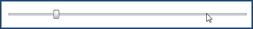
What?! You may be asking yourself the same thing. Why didn’t the Thumb move to the curser clicked position? How did it determine where to move? Enter the Small/Large change values. In my setting I have LargeChange set to 10. What is happening is when I visually click on position at about 80, the Slider sees a large change occurring and moves one LargeChange value. If I would have clicked close to the Thumb, SmallChange would have happened as well. This is quite annoying when your users will probably expect that clicking on the track will take them to that point.
Incidentally, the WPF Slider has a property called IsMoveToPointEnabled which turns this functionality on. This property is not available in the Silverlight Slider (as of Beta 2).
So what if you need that functionality? Well, here’s one way (with a hat not to my colleague John Lemire for turning me on to this method). This does involve some code and modifying the template, but it isn’t that painful at all.
Modify the Template
Using Expression Blend, we can modify what the template definition of a Slider is. To do this, open up the project in Blend, select the Slider object, right-click and choose Edit Control Parts (Template)…Edit a Copy. Give it a name (I named mine CustomSlider and kept it as a document resource as opposed to an Appliction one). You’ll then see that you can now edit the template. There is actually a template for Horizontal and Vertical (Slider has an orientation property), but let’s just concentrate on Horizontal. The template is made up of: Rectangle, 2 RepeatButtons and a Thumb. Make sure the Thumb is named “HorizontalThumb” as we’ll need to refer to it later. Now let’s add some Rectangles.
We’re going to add Rectangles “on top” of the RepeatButtons in use. You see, when you click on the track in Slider, you’re actually clicking on the RepeatButton areas. So right now our default template should look like this (for the HorizontalTemplate area only):
1: <Grid x:Name="HorizontalTemplate">
2: <Grid.ColumnDefinitions>
3: <ColumnDefinition Width="Auto"/>
4: <ColumnDefinition Width="Auto"/>
5: <ColumnDefinition Width="*"/>
6: </Grid.ColumnDefinitions>
7: <Rectangle Height="3" Margin="5,0,5,0" Grid.Column="0" Grid.ColumnSpan="3" Fill="#FFE6EFF7" Stroke="Black" StrokeThickness="0.5"/>
8: <RepeatButton IsTabStop="False" Template="{StaticResource RepeatButtonTemplate}" x:Name="HorizontalTrackLargeChangeDecreaseRepeatButton" Grid.Column="0"/>
9: <Thumb Height="18" x:Name="HorizontalThumb" Width="11" Grid.Column="1"/>
10: <RepeatButton IsTabStop="False" Template="{StaticResource RepeatButtonTemplate}" x:Name="HorizontalTrackLargeChangeIncreaseRepeatButton" Grid.Column="2"/>
11: </Grid>
We’re now going to add 2 Rectangles, one after the left RepeatButton and one after the right RepeatButton, named LeftTrack and RightTrack respectively. You can do this in the XAML code or just drag the Rectangles on the design surface in Blend and arrange accordingly. The result should be this:
1: <Grid x:Name="HorizontalTemplate">
2: <Grid.ColumnDefinitions>
3: <ColumnDefinition Width="Auto"/>
4: <ColumnDefinition Width="Auto"/>
5: <ColumnDefinition Width="*"/>
6: </Grid.ColumnDefinitions>
7: <Rectangle Height="3" Margin="5,0,5,0" Grid.Column="0" Grid.ColumnSpan="3" Fill="#FFE6EFF7" Stroke="Black" StrokeThickness="0.5"/>
8: <RepeatButton IsTabStop="False" Template="{StaticResource RepeatButtonTemplate}" x:Name="HorizontalTrackLargeChangeDecreaseRepeatButton" Grid.Column="0"/>
9: <Rectangle x:Name="LeftTrack" Grid.Row="1" Fill="#00FFFFFF" Cursor="Hand"/>
10: <Thumb Height="18" x:Name="HorizontalThumb" Width="11" Grid.Column="1"/>
11: <RepeatButton IsTabStop="False" Template="{StaticResource RepeatButtonTemplate}" x:Name="HorizontalTrackLargeChangeIncreaseRepeatButton" Grid.Column="2"/>
12: <Rectangle x:Name="RightTrack" Grid.Column="2" Grid.Row="1" Fill="#00FFFFFF" Cursor="Hand"/>
13: </Grid>
Visually you won’t be able to notice any difference because we added Rectangle elements that are have 0% opacity, so the Slider still looks the same.
Create Custom Slider Code
Ok, now let’s move on to code. I use Visual Studio 2008, so I’ll be referring to that. In Blend, you can right-click on the project and choose to Edit in Visual Studio which will open the project in Visual Studio for you. Once open in Visual Studio, add a new Class to your project, I called mine CustomSliderControl. We’re going to inherit from Slider so we can implement all the same features, we are just augmenting one of them.
We will need a reference to the Thumb and the two Left/Right Track elements we just added, so we’re going to make those member variables we can refer to later. We’re going to override one function: OnApplyTemplate. The overriding of OnApplyTemplate is only to set our member variables to the elements we’ll use in the other functions as well as set event handlers on our Left/Right Track Rectangles we added to the template. Since our elements exist in a ControlTemplate, rather than use something like FindName, we’re going to use GetTemplateChild and refer to the name (the x:Name) of the element.
We’re also implementing our own function OnMoveThumbToMouse, which will be attached to the MouseLeftButtonDown events on Left/Right Track. This function basically gets the Point position of the event (the mouse click) and sets the Value of our Sider to that position (based on looking at where it is in relation to the other elements). When it is all said and done, our CustomSliderControl code in complete should look like this:
1: using System;
2: using System.Net;
3: using System.Windows;
4: using System.Windows.Controls;
5: using System.Windows.Documents;
6: using System.Windows.Ink;
7: using System.Windows.Input;
8: using System.Windows.Media;
9: using System.Windows.Media.Animation;
10: using System.Windows.Shapes;
11: using System.Windows.Controls.Primitives;
12: 13: namespace CustomSlider_CS
14: { 15: public class CustomSliderControl : Slider
16: { 17: private Thumb _HorizontalThumb;
18: private FrameworkElement left;
19: private FrameworkElement right;
20: 21: public CustomSliderControl() { }
22: 23: public override void OnApplyTemplate()
24: { 25: base.OnApplyTemplate();
26: 27: _HorizontalThumb = GetTemplateChild("HorizontalThumb") as Thumb;
28: 29: left = GetTemplateChild("LeftTrack") as FrameworkElement;
30: right = GetTemplateChild("RightTrack") as FrameworkElement;
31: 32: if (left != null) left.MouseLeftButtonDown += new MouseButtonEventHandler(OnMoveThumbToMouse);
33: if (right != null) right.MouseLeftButtonDown += new MouseButtonEventHandler(OnMoveThumbToMouse);
34: } 35: 36: private void OnMoveThumbToMouse(object sender, MouseButtonEventArgs e)
37: { 38: Point p = e.GetPosition(this);
39: 40: Value = (p.X - (_HorizontalThumb.ActualWidth / 2)) / (ActualWidth - _HorizontalThumb.ActualWidth) * Maximum; 41: } 42: } 43: } Using the Custom Control
Now that we have this custom Slider, let’s use it. If we go back to our Page.xaml (or whatever XAML where you had the Slider control to begin with) we need to add a few things. First at the top, we need to add our XAML namespace so we can use it. For my sample code I used this (my UserControl decorations):
1: <UserControl
2: xmlns="http://schemas.microsoft.com/winfx/2006/xaml/presentation"
3: xmlns:x="http://schemas.microsoft.com/winfx/2006/xaml"
4: x:Class="CustomSlider_CS.Page"
5: xmlns:my="clr-namespace:CustomSlider_CS"
6: Width="Auto" Height="Auto"
7: xmlns:vsm="clr-namespace:System.Windows;assembly=System.Windows">
Notice the “xmlns:my” decoration that points to my CLR namespace for my project. This will enable me to use this in my XAML later. Now I can simply find where I used <Slider/> and change to <my:CustomSliderControl/> like this:
1: <my:CustomSliderControl Cursor="Hand" HorizontalAlignment="Stretch"
2: Margin="8,17,8,20.0499992370605" VerticalAlignment="Stretch"
3: LargeChange="10" Maximum="100" SmallChange="1" Value="20"
4: x:Name="MySlider" Style="{StaticResource CustomSlider}"/>
I don’t have to change anything else, nor do I have to change the Style attribute. Since our custom control inherits from Slider, all the other types still apply. You’ll notice that the style itself still has the TargetType=”Slider” attribution and this will work for our custom type because it is a derivative. Here’s the result (using Silverlight Streaming): click here.
Summary
So as you can see we can extend some of the base controls rather easily. I hope this didn’t sound too confusing because it really isn’t. You can download the entire source here in C# or VB to see for yourself. This particular extension may be helpful when using Slider as a media track representing the timeline for a particular media element.
I hope this helps!
Please enjoy some of these other recent posts...
Comments